Data Visualization For All: My Proposal to Create a MOOC for Trinity edX

Posted on

Trinity College recently invited faculty to respond to a call for proposals to create massive open online courses (MOOCs) for our edX platform. Here’s a copy of my submission.

Data Visualization For All
Proposal to Trinity College edX
by Jack Dougherty, Professor of Educational Studies
last updated March 1, 2016

1. Course Title and Description:  I propose to create Data Visualization For All, an introductory massive open online course for the Trinity edX platform. A growing number of free software tools now allow ordinary users to transform data tables into interactive charts and maps. By learning how to design and embed meaningful visualizations on our own websites, the breadth and depth of our communication becomes more powerful than conventional paper. This course introduces design principles for working with easy-to-learn tools, including step-by-step tutorials, short videos, and real-world examples. The learning objective is best summarized by the course tagline: “Tell your story and show it with data.”

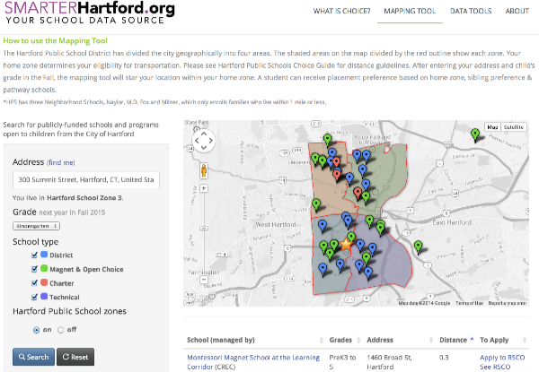
This online course expands on my Data Visualization internship seminar, FORG 210-04, which I first taught in Spring 2014 and am currently teaching in Spring 2016. Trinity students from various majors (including anthropology, computer science, economics, educational studies, environmental science, mathematics, psychology, public policy, and sociology) meet with me for one hour per week and learn to co-create data visualizations with their Hartford community partner organizations, in fields such as public health, economic development, food distribution, policy journalism, and education reform. Currently, we are videorecording the seminar to capture excerpts of student questions and rich examples for possible inclusion in the online course. Learn more and view the syllabus at http://commons.trincoll.edu/dataviz.

This introductory online course has no prerequisites, and is designed to make data visualization more widely accessible to all. While teaching our seminar, Veronica Armendariz (Trinity ‘16) and other contributors and I have begun writing an open-access digital textbook, Data Visualization for All (http://DataVizForAll.org). This book will provide the content for much of the online course, which I envision as six one-week units:

  • Design Principles for Data Visualizations
  • Find and Transform Data
  • Create and Embed Interactive Charts
  • Point Maps Versus Polygon Maps
  • Modify Code Templates on the Web
  • Tell Your Story and Show the Data

First, we begin with design concepts and essential spreadsheet skills (inserting formulas, sorting, pivot tables), which many Trinity students tell me that no one has ever taught them. Second, we create and embed charts and maps using easy-to-learn tools with a graphical user interface, such as BatchGeo, Tableau Public, and Google Fusion Tables. Finally, we learn how to modify existing code templates and host them online with user-friendly GitHub browser tools. Although the course presumes no prior experience with coding, it concludes by teaching students how to “tweak” existing data visualization code that can be found and shared online.

2. Audience: The online course is designed for two audiences. First, Trinity students who enroll in future semesters of the credit-bearing data visualization internship seminar will work through the online instructional content before class, to allow for more interaction and discussion during class. Second, learners from outside Trinity will enroll in the edX course. Trinity students and I have led half-day data visualization workshops for non-profit organization staff, sponsored by the Hartford Foundation for Public Giving. Although I have not publicized Data Visualization for All beyond these workshops, GitBook statistics reveal that nearly 10,000 visitors have discovered the online book-in-progress, and over 500 have downloaded a free e-book, since April 2015.

DataVizBook.org GitBook web traffic from April 2015 to present

3. Distinctiveness: This online course will highlight Trinity’s urban engagement and community learning initiative. Data visualization examples will be drawn from two years of Trinity student partnerships with Hartford non-profit organizations, and our efforts to help them tell their stories and show their data. In our current internship seminar, seven Hartford community partners have granted permission and have been video recorded while working with their Trinity students.

4. Research and Design, and Benefit to Trinity Students: This data visualization course is well-suited to the online format because the core learning objective is to teach students how to communicate more effectively on the web. Also, the online format allows individual students to replay tutorial videos at their own pace, and it also brings together a community of learners to share links and comment on each other’s visualizations. Trinity students in future Data Visualization internship seminars will benefit from online course material before class, to allow more interaction and discussion during our one-hour weekly class sessions. Finally, pending funding, Trinity students who completed the course may be hired to work as “virtual teaching assistants” and respond to off-campus learners’ questions on the edX discussion board.

5. Timing: I propose to launch the edX course in February 2017. This schedule allows me and an instructional technologist to create the course in Fall 2016, and to preview it with the next cohort of Trinity students in the Data Visualization internship seminar in January 2017.

6. Stipend: I plan to request a course stipend rather than a TU release.

Embed Tableau Public as an iframe in WordPress.org

Posted on

To embed a Tableau Public data visualization as an iframe in WordPress, like this:

1) In the Tableau Public server page, click the Share button and copy the source link (not the embed code). For this example, the source link for the sample above is:
https://public.tableau.com/views/DataVizBook-simple-scatterchart/Sheet1?:embed=y&:display_count=yes&:showTabs=y

2) Remove all of the code after the question mark, to look like this:
https://public.tableau.com/views/DataVizBook-simple-scatterchart/Sheet1?

3) Add this at the very end of the code:
:showVizHome=no&:embed=true

4) The new source link for the sample above is:
https://public.tableau.com/views/DataVizBook-simple-scatterchart/Sheet1?:showVizHome=no&:embed=true

5) Place the new source link inside the iframe plugin shortcode for WordPress, like this:
[iframe src="https://public.tableau.com/views/DataVizBook-simple-scatterchart/Sheet1?:showVizHome=no&:embed=true"]

more text

Designing a school search tool with Achieve Hartford

Posted on

In summer 2014 we collaborated with Achieve Hartford to design a school search tool that shows city parents their eligible public school choices. Our goal is to replace the existing SmartChoices site, which Trinity created in 2008, with a simpler tool that’s easier for a small non-profit organization to maintain on their own. To accomplish this task, we turned to Google Fusion Tables and the Searchable Map Template created by Derek Eder at DataMade in Chicago. Derek worked with us to expand his open-source code (available on GitHub) to display a sortable table of results in addition to the interactive map. It’s a responsive design, meaning that it adjusts the display to fit the size of your device, such as tablets and smartphones. Learn more about the background of this project and explore the beta version of SmarterHartford.org (which will be publicly launched soon).

Cick to explore the beta version of SmarterHartford.org.
Click to explore the beta version of SmarterHartford.org.


Explore Hartford Data: HPS student change by neighborhood, 2007-12

Posted on

As part of my data visualization work with Achieve Hartford this summer, I explored ways to make educational data more accessible and useful to the public. The Hartford Public Schools (HPS) compiles information on thousands of individual students, and while raw data files cannot be directly released due to privacy laws, the City’s brand-new Hartford Data initiative created a better way to request and work with this type of data in public formats. Their staff encouraged me to submit a data request on their new website (http://data.hartford.gov) to aggregate student-level data into larger units, which can be publicly shared without violating confidentiality, because batches of students are grouped together without individual identities. I submitted my request for HPS student data (over 20,000 files) to be aggregated into the 17 city neighborhood units. Back in 2008, HPS stopped assigning students to schools by neighborhood residence, and began an “all-choice” initiative where students can apply to attend any HPS district school (or the growing number of interdistrict magnet and charter schools), regardless of residence. Since students do not necessarily attend what we used to call their “neighborhood school,” there has been no easy way to obtain neighborhood-based data on HPS students. But this is changing.

HartfordDataLogoToday, the Hartford Data staff publicly released the first installment of my data request as the first entries in their Education/Youth/Family category. The HPS neighborhood data is divided into two files (2007-10 and 2010-12) due to a federally-mandated change in how student race/ethnicity is reported. Behind the scenes, the Hartford Data staff obtained HPS student-level files with street addresses, geocoded each point on a digital map, then grouped them according to neighborhood boundaries. My understanding is that they successfully geocoded over 97 percent of the student addresses, which is pretty good in light of the many spelling errors and PO Box numbers that pop up during the process. This first batch includes student enrollment data by gender, grade, and race/ethnicity, but does not yet include other data, such as the HPS schools attended (inside or outside of the neighborhood area), or other data points such as average student achievement levels. I also have another request to aggregate HPS student data by census tracts, which are smaller units than the official neighborhoods. In fact, I was so eager to use the new Hartford Data platform that they talked me into serving as a member of its advisory board. Be careful what you wish for.

HPS-neighborhood-change-closeupWhen the data finally appeared online, the question that immediately came to mind was: how much have HPS student enrollments risen or fallen across neighborhoods from 2007-12? First, I blended together the total numbers of students in the two files and calculated the percent change. Next, to visualize this data on a map, I uploaded the spreadsheet into a Google Fusion Table and merged it with the neighborhood boundary map that I also downloaded from the geographic data section of the Hartford Data site. The result is the interactive thematic polygon map embedded at the top of this web post, and you can learn how to create your own (for free) by following my Google Fusion Tables tutorial, which I presented to several groups this month at our Open Data Visualization workshops. Some nice features of Google Fusion Table maps are that users may click on any region to view its data, or click on a link in the legend to see all of the data in the underlying spreadsheet. It’s not a perfect map: I still can’t figure out how to easily display percentages rather than decimals in the legend. But if you’re a non-profit organization or neighborhood group that doesn’t have a big technology budget, the free Google Fusion Tables tool and a free online tutorial or workshop may be a good solution for you.

Overall, I was surprised to see such sharp declines in HPS student enrollments, shown in dark red in the city’s northwestern area (Blue Hills -32%, Upper Albany -26%) and also the South West neighborhood (-20%). Together, these three residential neighborhoods experienced a loss of nearly 1,300 HPS students over five years. Although dark green areas of growth appear in Downtown and South Meadows, the raw numbers of students living in these neighborhoods are very small, and the combined gain is only 30 students.

Why are these changes happening? I don’t yet have all of the data to fully interpret it, and welcome informed input from readers. As I always tell my students, think about what maps do not show us. First, today’s new data comes from HPS, which means that it includes only students enrolled in HPS-run schools (both district and magnet), and not residents of Hartford neighborhoods who attend non-HPS magnet schools, charter schools, the suburban Open Choice program, and non-public schools. We know that public school choice programs have grown over the past several years, and Several researchers involved with the Cities Suburbs and Schools project at Trinity College and I are seeking more data from the Connecticut Department of Education and public school choice providers to help fill in this part of the puzzle. Second, there also may be population shifts affecting selected Hartford neighborhoods, which we may be able to nail down with American Community Survey data from the US Census. More work to be done.

Explore your own questions by checking out Hartford Data (http://data.hartford.gov) and the related CT Open Data site (http://data.ct.gov), browse their growing collections, post your own data requests, and share your results on the public web.