K-12 Environmental Theme Schools in the Park River Watershed

Posted on

Water quality and quantity are measurable in our bodies, rivers and built environments. We depend on this natural product to sustain us and keep communities flowing and regulated. Every being on this planet depends upon water. Yet, we still face challenges convincing our neighbors, peers, and communities to work together and give people the tools to make differences that improve our one and only shared natural earth.

Click on the map above to open in a new tab.
Click to view live map in a new tab/window.

In order to develop a successful watershed stewardship, we need to identify interested groups, such as schools, home owners, park friends & groups or municipalities, etc., who live on or around the river. Many people don’t realize that their own back yard contributes to the health of a stream ecosystem. For example, lawn fertilizers or salt deposits washed from rainstorms can quickly build up in our reservoirs or drainage systems. These problems created by us can lead to myriad issues including changing the pH, temperature, or even flow of the river, which can ultimately deteriorate the river and organisms over time. The Park River Watershed can help orient these interested groups towards annual activities that improve water quality and gather information from these events and organizations. Thus, we are able to gain aggregate site specific data.

Collected data can then be forwarded to state and federal environmental programs or government agencies as well as nonprofits that work on the larger water bodies such as Connecticut River Watershed Council and Save the Sound, which is the Long Island Sound coastal environmental nonprofit group.

With help from Trinity College students, Shaina Lo and Veronica Armendariz were able to create data visualizations about certain schools in the Park Watershed that incorporates environmental goals into their school curriculum. Public school information was obtained from the SmartChoices website, and the Park Watershed Project categorized the school data. From this website, one can read further on deciphering the differences between the types of SmartChoices schools around the Hartford area region. SmartChoices includes public school in the city of Hartford as well as 19 other suburban towns.

This interactive data visualization can help parents around the Hartford area view specific schools they are interested in for their children that are concentrated on environmental goals. It my also be helpful for teachers or people interested in the educational system to help them discover these specific schools that are in or around the Park River Watershed.

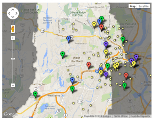
Below are the descriptions and color identifications for each school:

Yellow/1) Water or wetland adjacency: school grounds are within walking distance of a river, brook, or pond. This increases opportunity for water quality monitoring, environmental research and stream stewardship.

Green/2) Environmental goals: School curriculum prioritizes natural sciences, which increases potential for local environmental research and stewardship.

Purple/3) A nature trail, park, or open space within walking distances indicates opportunities for classroom or extra curricula site specific (environmental activities).

Pink/4) Science goals could include topics such as medicine or technology that is not directly related to the environment.

Red/5) STEM schools are schools that concentrate on Science, Technology, Engineering, and Math.

IPC Transition Plan

Posted on

The data I received came from a database of Pediatric Trauma Patients from 2007-2012 which is owned by Connecticut Children’s Medical Center. All the data that I have are either in Microsoft Excel format or Google Spreadsheet. Because a lot of information is confidential in the original data or easily identifiable, the original data set cannot be shown publicly. However, as long as it is de-identified , such as removing specific columns of data (ie. age, city/residency) data may be displayed.

All my graphs and visualization can be accessed through my github site here. As for the actual data, all my formatted data is on a Google Drive folder that is easily accessible with the visualizations as well.

Although these are simple charts, the formatting of the data may be useful for the future just in case a data visualization expert would want to create more sophisticated charts. Although I do not have the training in coding that is required for more complex visualizations, I feel like the ones I have now create potential ideas for future visualizations. However, complex visualization may not be necessary because there is still so much that can be visualized from the data set.  Just using Google Charts can be sufficient for creating more visualization that don’t require expertise in data visualization.


A11: Transition Plan for Park Watershed Data

Posted on

The tools I have been using for my data visualization are all public and can be found online. As of right now, I am the owner of the graphs and tables I’ve made. However, by creating a Gmail account, anyone can access the Google Fusion and Wizard tables. I would simply have to share it with anyone who wishes to view or edit any changes. Organizations and non-profits, such as the Park River Watershed, could easily create an general account, which would make things easier and more convenient when handling data changes and switching over to who has accessibility to update it.

I also received sample data of the ‘interdistrict’, ‘district’, and ‘more Pre-K centers’ from Professor Jack Dougherty who retrieved this data from SmartChoices. From this website, one can distinguish between the different types of SmartChoices schools around the Hartford area region further.

Finally, I created data visualization through GitHub repositories, which can be easily found by searching my username: slo2293. Data and HTML coding here can be forked with other users and updated through Java Script. Jack has also created a wonderful tutorial for first time users to understand here in his Data Visualization WordPress. Though coding is not for everyone, there are other files one can search for to tweak for their liking.

Overall, the data and tools that I worked with were all pretty standard in terms of difficulty of accessing or understanding things. GitHub and Google Drive are public sites for anyone to create an account, and the SmartChoices descriptions are all public.

Transition Plan

Posted on

The data I used to create my visualization was simply found on the internet. These useful locations and points in West Hartford can be changed and others can be added or removed. The goal and intention was simply to find useful resources for children 8 and under. This visualization show’s these location in the West Hartford boundary.

I imagine a map such as mine can be used or maps that are specifically used for solely one of the types of locations. Such as a map of only day cares or dental care.

I first used google fusion tables that can be located through this link.

Polygon data

Point data

And finally I used github to create the two layer map, that can be found here.