[Posted by Henry Arneth, Trinity ’09 and a member of the Watkinson staff]
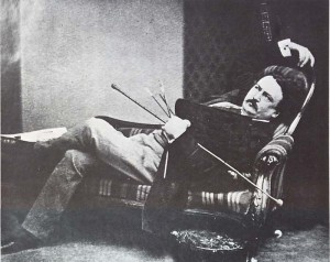
Gustav Doré (from Gosling, below)
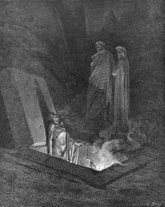
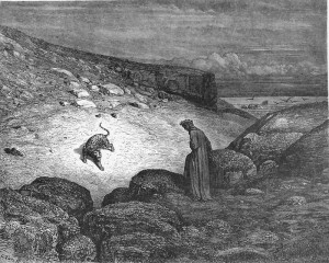
 For over 100 years, the names Dante and Doré have been linked in literature; one of the reasons is that Dante’s Divine Comedy—the epic poem—is one of the many works illustrated by Gustave Doré and is one of Doré’s best known illustration cycles. The strongest evidence on how this union came about is straight from the artist’s mouth: “I conceived at this epoch the plan of these large folio editions of which Dante was the first volume published…My idea was then and always has been since, to produce in a uniform style an edition of the best authors, epic, comic, and tragic” (Lehmann-Haupt).
Doré’s assessment was made in 1861, the same year as he illustrated his famous “Doré” Bible. However, despite the fact that Doré had been illustrating books for a number of years, there was still some doubt about the desirably of such a large book. The proposed size was about 16 inches high and about a foot wide when the book was closed—a large and costly format. Part of the publisher’s hesitation was the final cost to the consumer; but given the man that Doré was, he also had an answer to that problem—to bring out the first book of the Divine Comedy at his own expense. This meant that all of the profits would also be Doré’s as well. The edition of 3,000 sold out within weeks and was subsequently translated into many languages. In the end, to ensure that the book would see the light of day, he sold the rights to the printer and two of the engravers.
 For the prolific Doré, this wasn’t much of a blow. He was constantly working, and he liked to work quickly from his head—rarely, if ever, doing any preliminary sketches, and often drawing straight onto the wood block. This is not to say that he didn’t understand the art nor that he couldn’t sketch, but that he chose to skip a step—which harkened back to Doré’s childhood when he would often envision a scene, right down to the most minute details, as he listened to stories. “When a fairy tale was told to him, he immediately visualized the whole scenery with every detail of costume and character in perfect reality” (Lehmann-Haupt). Apparently, this type of visualization was a gift Doré carried with him all his life.
But then it wasn’t unusual for an artist to sketch his idea on a block and leave it for an apprentice of sorts to do the actual engraving—it was the way most texts were illustrated. In the history of art, many great artists would paint what was deemed as the most important areas (faces, hands, general poses and compositions) in their paintings while assigning other, less important areas to the amateurs in his workshop. “He [Doré] thoroughly understood the technique of wood engraving, although I am not sure that he ever engraved a single line into a piece of boxwood with his own hand” (Lehmann-Haupt). So, in a way, Doré was simply continuing a long tradition. But unlike the artists of old however, Doré allowed his engravers to sign their work. If you take a close look at Doré’s engravings, you will sometimes notice two signatures—Doré’s and a second name. This second name is that of the artist who did the actual engraving.

This practice can also account for a slight discrepancy in the quality of the engraving in Doré’s work. After the Inferno had been released, there was a lapse of several years before Doré illustrated the other two books of the series—in 1868 he added 60 plates to his Dante, for Purgatory and Paradise—which were of inferior quality compared to the images he designed for the Inferno seven years earlier. If we are to believe Lehmann-Haupt’s claim that Doré may never have engraved a line for himself, the proof could be found in the lack of consistency in Doré’s illustrations for the three books that comprise the Divine Comedy.
 Sources: Hellmut Lehmann-Haupt, The Terrible Gustave Doré (1943); Nigel Gosling, Gustave Doré (1974)