[Posted by Mollie Hantman-Weill for ENG 812 Modern Poetry, Professor Rosen]

Moore1At only a few inches tall and a few millimeters wide, Monroe Wheeler’s Manikin Number Three, a printing of Marianne Moore’s poem “Marriage,” is tiny and unassuming. The copy was presented to me in a red cover with an envelope taped to the inside binding. Once opened, the envelope reveals the small copy of Marianne Moore’s work. The cover is bright blue, with a Greco-Roman style depiction of a scene from Homer’s The Odyssey. Printed in 1923, this is one of 200 copies that were produced. Monroe Wheeler, a publisher and New York native, had previously published Manikin Number One, a very small collection of poetry by Janet Lewis, and Manikin Number Two, a printing of William Carlos Williams poem “Go Go” only months earlier. Harry Bacon Collamore, a lover of poetry, who gave many books of poetry to the library, donated this copy of Manikin Number Three to the Watkinson Library.


Moore2The font is particularly interesting. The cover and title page is printed in a type set called Narcissus Roman, named after the hunter of the Greek myths, and was invented by Walter Tiemann in 1921, two years before Wheeler’s publication. This font was commissioned for a sandpaper company and was inspired by a series of ornamental inline capitals first made in 1745 in France. Narcissus Roman aims to inspire thoughts of early 1700’s era Paris, and of Louis XVI. This typeset is also credited for sparking the revival of 18th century Parisian-style typography in 1920’s America.

The first few pages of the printing are not bound to the rest of the pages. Glenway Wescott, American poet (though an expatriate living in Paris for much of his life) wrote a few hundred words on Marianne Moore to be included in Manikin Number Three. Why Wescott? As it turns out, Wescott and Wheeler were dating for much of their lives, the relationship not ending until Wescott’s death. Wheeler must have convinced his boyfriend to write a forward for his publication. Wescott’s introduction, called “Miss Moore’s Observations,” is a slightly rambling, four page compliment of Moore’s work. He speaks to Moore’s talent, even going so far to recommend the reader other poems by Marianne Moore he thinks they would enjoy. My favorite except of his writing is as follows:

An untrampled field of experience presents itself to Miss Moore’s unquailing mild untroubled stare. She has then, naturally enough, no desire to be radical or secretive in her meaning. She wishes to convey or evoke. If the idea and its emotion seem obscure to anyone it is because they are unusual. I have a friend to whom no concept seems single and unified which is not made up of components joined in a familiar way by familiar desires or drama. Those who miscomprehend Miss Moore, unless they are wholly indolent, are like him. So much for the ‘meaning.’

The poem is printed following Wescott’s introduction. At the end of the poem, Marianne Moore signed and dated the copy (November 7, 1953). I am confident that if she had seen any misprints in the poem, she would have corrected them when she signed it, but, as there were not marks on the copy other than the signature, we can assume that the poem was printed exactly as she wanted it to be. I do not know why Wheeler choose this specific poem to be the only Moore poem to print, besides that it is an excellent work, but one guess is the length of the poem. “Marriage” is close to three hundred lines long, making it just long enough for the print to be substantial without needing multiple poems, which would make it a collection.

Moore3The copy ends with a quote, chosen by Wheeler, from The Anatomy of Melancholy by Robert Burton, published in 1621. The quote reads, “Even so might Virginia, and those wild Irish have been civilized long since, if that order had been hitherto taken, which now begins, of planting colonies, etc.” Below that is the price of the item, circa-1923, and Monroe Wheeler’s street address. Today, this copy would be sold from anywhere between four hundred dollars to one thousand dollars, depending on condition and whether or not it was signed.

9
May

Baskin’s Crane

   Posted by: rring   in book history, Classes, Students

Baskin1[Posted by Justin Martin for ENG 812 Modern Poetry, Professor Rosen]

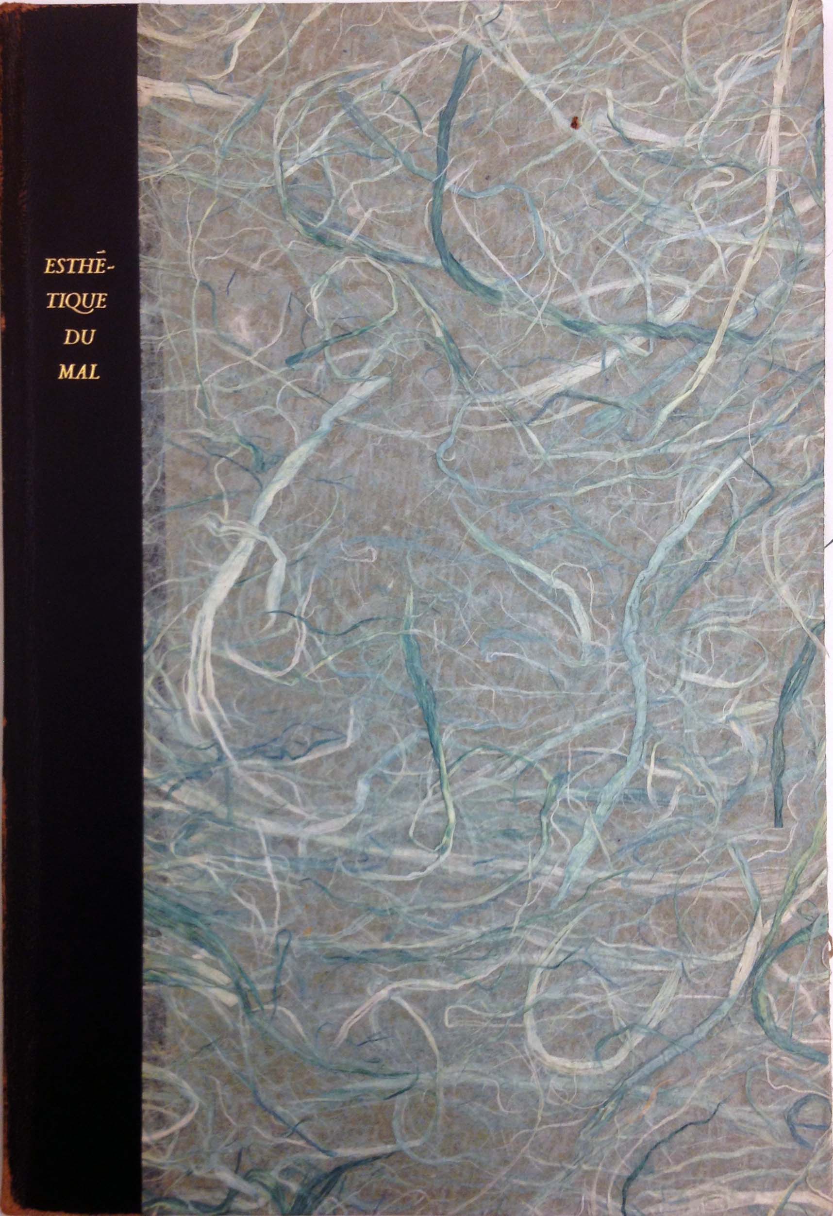
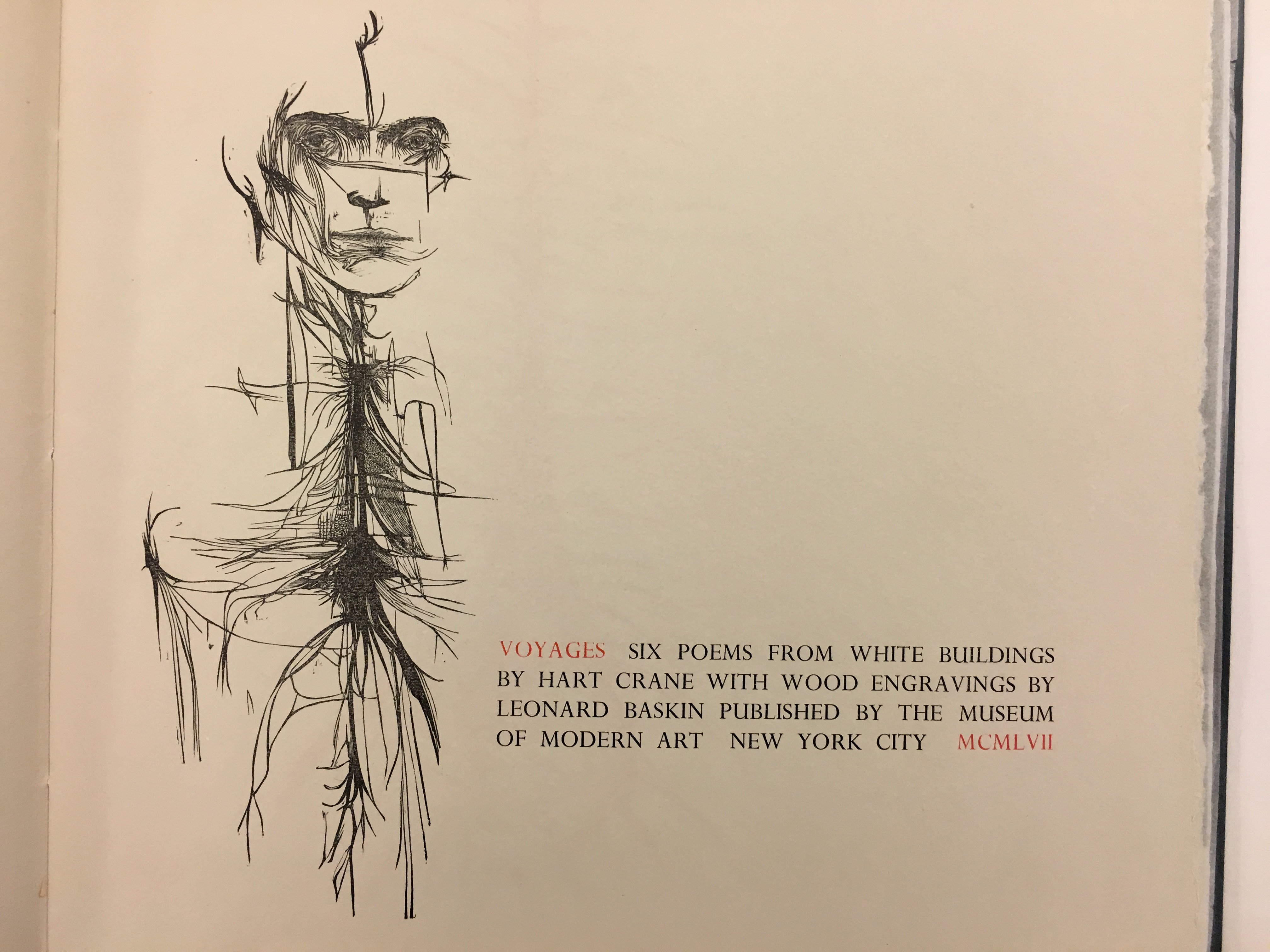
Hart Crane’s visage (who could mistake his decimating eyes) stares from atop a torso-like mass of dark veins and lines on the second title page of Voyages: Six Poems by Hart Crane, an artistic rendering of Crane’s celebrated erotic suite published 25 years after his suicide. The poems, which feature threads of nautical imagery throughout, take on strange new meaning in the print: “The sea lifts, also, it’s reliquary hands.” Hart Crane now lies somewhere within that sea, and his poetry continues to find new light and appreciation in his absence, in this case in the accompaniment of Leonard Baskin’s wood engravings, which, as well, are a part of the bold title card pasted to the front of the book’s four-fold case.

Leonard Baskin, born in 1922, was 10 years old when Hart Crane passed away. In 1942, while studying at Yale University, Baskin founded the Gehenna Press, initially for the purpose of publishing fine pressings of his own works – the company’s first two releases were books of Baskin’s own poetry and wood engravings, respectively. These first two books, On a Pyre of Withered Roses and A Little Book of Natural History, were published nine years apart, the second’s release delayed by Baskin’s time serving in WWII. Baskin’s purpose in founding and developing the Gehenna Press, one might speculate, was to follow the lead of William Blake’s duality as poet and bookmaker. Leonard’s poetry on its own never claimed much right to legacy, but he certainly had insights into the workings of the craft and an appreciation for influential predecessors like Crane.

Baskin2The book itself mimics the qualities Crane takes on at times in the Voyages: sensitive, textured, always hinting at something deep and monstrous beyond the surface. Crane’s poetry is printed on Amalfi handmade paper, accompanied by seven of Baskin’s engravings printed in one instance on the aforementioned Amalfi paper, but for the most part on much thinner, transparent japanese paper, which is, in one instance, bound into the book’s spine, and, otherwise, pasted quite precariously onto the other, thicker pages.

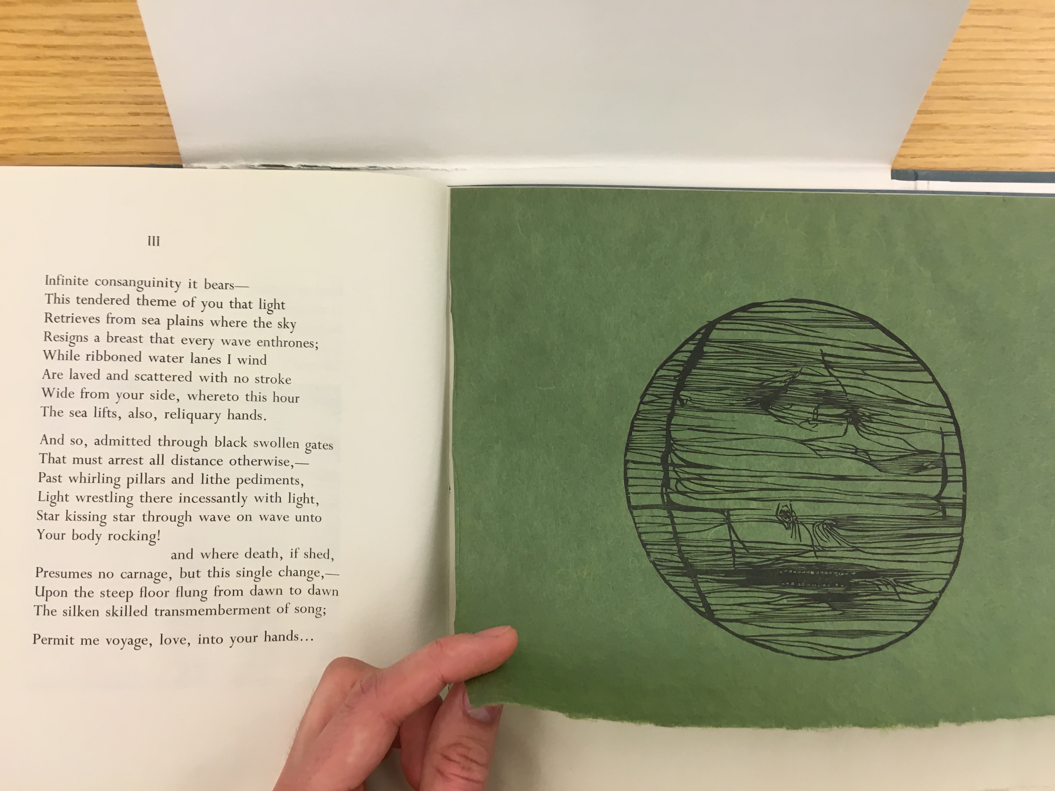
One particular print, a circular design which frames an abstract landscape of lines and fractured details, accompanies the third voyage, perhaps the most iconic of the six, on a green sheet of the thin japanese which is pasted across the top edge, horizontally, to the opposite page, left to hang unglued on all other sides, like some ghastly hanging curtain. Scattered vertical line fragments in the wave-like texture resemble “ribboned water lanes…/ laved and scattered…”


Baskin3The book held at the Watkinson is one of 975 copies originally printed, all by hand. It is a slender little thing. The cover is worn, presumably by time. It commands a certain amount of spectacle as its quad-folding encasement opens at all angles, only to reveal the actual book inside to be near-identical to the encasement’s cover. The book itself forces one to be intimate with it: the thin, fragile Japanese pages peer out from behind their thicker, whiter counterparts, and, as one progresses through the Voyages, prove to be pasted in at differing angles, prompting one to constantly adjust their attention so as to avoid tearing the things out.

One of Baskin’s most powerful contributions to the poetry: the sprawling circuitry of a beak emerging from the engraving accompanying Voyage IV. The bird lies motionless on the page, its talons seemingly hanging from the mess of intricate lines which makes up the bird’s body (so delicately spacing out and unraveling within its breast). The cut is a haunting rendition of, perhaps, the “chilled albatross’ white immutability”.

A print of Voyages by Gehenna and the Museum of Modern Art could cost anywhere between $200 and $700, depending on wear on the copy and whether it is signed or not, and can be found fairly easily via a google search or on websites like Abebooks.com.

Baskin4The print can be taken as a work firstly and perhaps solely done by Baskin himself, since its publishing date, 1957, is before Baskin turned over his position as sole printer of the Gehenna Press. Baskin obviously wanted to not only present, but interact with the poetry in his printing, creating an entirely new experience out of Crane’s Voyages, intimately giving texture, in both the two- and three-dimensional senses, to his verses. Crane’s eyes in his portrait seem to speak to this intimacy; their openness spills down into the sharp and tense mass of tendrils below, within the ribcage.

Baskin5

9
May

An unknown Frost poem?

   Posted by: rring   in Americana, book history, Classes, Students

[Posted by Cameron Driscoll for ENG 812 Modern Poetry, Professor Rosen]

Frost1For my Modern Poetry class with David Rosen, I was assigned to find something interesting at the Watkinson Library pertaining to the poet Robert Frost. While looking at some of the books donated by a Mr. Henry Bacon Collamore, I came across a copy of North of Boston. Inscribed on the inside of the front cover was a poem—specifically a sonnet in iambic pentameter, personally written by Robert Frost for Mr. Collamore.

Here is a picture of the poem in its original condition

The poem was written in Frost’s cursive handwriting, and was a bit hard to transcribe, but after some help from the team at the Watkinson, I was able to figure out what was written. Low and behold, when I was done, I realized this was a totally new poem by Robert Frost— one unknown to the outside world. Here I present publically for the first time, “A Convention” by Robert Frost:


A Convention

While they beneath bepennoned gardens yearned

With blare of brass and eloquence amain

For legislation to relieve the pain

Of living having been too hardly earned,

Something went right: outside the weather tunnels,

The drouth was broken with a little rain;

And in that merely momentary gain

Their meeting, cause, and party were adjourned.


Yet there had been the surest of the sure

About the malady if not the cure:

It was a case of desert: earth would soon

Be as uninhabitable as the moon

What for that matter had it ever been?

Who advised man to come and live therein?

Firstly, I should say that frost uses quite a bit of archaic language in this poem that was very hard to recognize, and therefore to transcribe. Instead of using the more modern “abound” or “surround” frost uses the word “amain”. This example of archaic language appears to be uses entirely for form in order to rhyme with the word “pain”. Next, he used the word “drouth” which is an archaic synonym for the word “drought”. One word in particular, appearing in the first line, was the most difficult to transcribe: “bepennoned”. Firstly, you will not find this word on any online dictionary, or for that matter in any handheld dictionary that I could find. I asked in my Modern Poetry class if anyone had any idea what it meant, and there were various ideas, however, none of them seemed satisfactory. Luckily, my mom is an English major, and a very smart one at that, so I asked her, and after 10 minutes she came back to me with the answer. Thanks mom, you rock.

The poem appears to be about a town meeting that is about to discuss a drought that has left a town without water. The town is full of symbols of wealth and abundance: they have gardens with pennants hung between them, everything is “eloquent” and brass instruments are used to convene the convention to order. However, despite this societal wealth, they are resource poor in water, as they haven’t had any rain, and, of course, cannot support the town without it. Frost wrote a lot about the relationship between man and nature, and I think this poem is an example of Frost pointing out how man often tries to claim a certain knowledge about nature that is entirely unfounded, and more generally, how men are often far too sure of themselves.

They are ‘legislating’ to “relieve the pain” of this drought.  However, as they discuss this problem, all of the sudden a light rain storm comes and breaks the drought. This is in some ways a bit ironic, as several in the convention were among the “surest of the sure” that the drought was a “case of desert” that would soon render the whole planet as “uninhabitable as the moon”.

The poem ends by asking two interesting questions. Essentially, he is asking about the origins of man. The first question appears to be rhetorical and can be taken one of two ways: either Frost is saying that the plant had never been “uninhabitable as the moon” or it always has.

The second question is even a bit stranger, “who advised man to come and live therein?” Is Frost trying to say that God was mistaken in putting man on Earth? Is he asking more specifically about who’s idea it was to ship people over to North America? I am unsure, however, I am certain some other young English student will come across this poem and will continue the work I have started here.

The Watkinson rocks.

Have a great summer.


[Posted by Bridget Reilly for ENG 812 Modern Poetry, Professor Rosen]

Stevens1Wallace Stevens’ Esthétique du Mal was published in July 1945. Holly Stevens, the poet’s daughter, gave the book to the Watkinson and it is one of 300 copies printed. The modestly sized book is made from luxurious materials that Stevens personally selected. The cover is decorated with vibrant blue Natsume straw-paper and the poem is printed on supple pace paper. Abstract illustrations by Wightman Williams accompany the poem. Stevens3George Dillon, the critic who reviewed the book when it was first published, likened Williams’ designs to the “marginal doodlings of his satanic majesty” (97). Dillon’s assessment seems an apt description of the bizarre illustrations. However, the drawings and the fine materials Stevens selected make the book a visually interesting object. Dillon admitted that the book was an artistic achievement and called it “a blue phenomenon” (97). He writes, “his [Stevens’] new long poem […] has been made into something which belongs to the décor of opulence” (97).

Stevens, no doubt, would have been pleased by Dillon’s assessment. His 1945 correspondence reveals that he was deeply concerned with how the book would look and function, not poetically, but as a physical art object. Between June and November, Stevens wrote three times to his friend and multimedia artist James Guthrie. In each letter, all of which can be found at the Watkinson, Stevens talks almost exclusively about the book, its materials, its design, and the process of its printing. In his responses to Stevens’ letters, Guthrie attempts to open up the discussion and talk about current events and his own poetic endeavors, but Stevens always directs the conversation back to Esthétique du Mal. It seems that for the good portion of 1945, the book’s production was one of Stevens’ main interests, and, at times, the cause of great stress.

Stevens2However, in June, Stevens writes optimistically about Cummington Press, the small boutique printer he was working with. He informs Guthrie that the press is “really the work of not that much more than one man [Harry Duncan],” and his partner Wightman Williams (the books illustrator). He explains that the work they do is “quite extraordinary” (June 25 1945).

By October, Stevens was still certain that the book’s printing job “definitely add[ed] to the text.” However, in his letters, Stevens seems less happy with the book and the press. He mentions to Guthrie that he is weary about Duncan’s and Williams’ desire to “use color to some extent” in the poem’s text. Stevens downplays his reluctance to Guthrie, but in a letter to Duncan, Stevens does not hold back. Stevens explains, “I cannot think of a decent book that I have in which the text is printed in colored ink, and I am strongly against it. However, I leave the make of the book to you” (Cummington Press Correspondence10). Not surprisingly, the poem was printed in black ink.

In addition to questioning Duncan’s and Williams’ creative sensibilities, Stevens was also displeased with the delay of the book’s publication. He explains to Guthrie that the book’s production is behind schedule and that the press “feels victimized.” Considering the technology Duncan and Williams were dealing with and the bullying tone Stevens often took with them, perhaps the pair had good reason for feeling that way. The hand-press, which “was operated manually by two people and resembled the press that Gutenberg invented,” could only work on cool days with high humidity (NewYorkTimesObit). This made printing mostly seasonal and not nearly as efficient as the high-powered executive poet would like it to be. In addition, because of World War II the press continuously experienced paper shortages. At one point, Duncan and Williams had to use Pink straw-paper for the cover instead of the blue Stevens had selected. As one can imagine, Stevens was not pleased. For Stevens, neither the war nor technological glitches seemed good reasons for the delay of the book’s printing. He writes to Guthrie that the book really “ought to have been published by this time” (Oct 18 1945).

Based on his correspondence, it is clear that Stevens spent a lot of time thinking about the book’s production and its appearance. Indeed, as far as Esthétique du Mal was concerned, Stevens was as much, if not more, interested in how the booked looked as he was with the poetry it contained. When the book was finally finished in November, four months after publication date written on the title page, Stevens sent a copy to good old Guthrie. In his letter he writes, “I shall be interested to know what you, yourself, think, not about the poetry, but about the book” (Nov 23 1945).  Stevens’ preoccupation with the aesthetic appearance of this material object seems to give credence Robert Frost’s critique that Stevens was a poet of “bric-a-brac” (NewYorker). Admittedly, Stevens’ discussion of the book suggests that it can be seen as one of many beautiful objects that interested the insurance executive, who lived well and was unopposed to weaving images of material comfort into his poetry. When publishing Esthétique du Mal, Stevens insured that the book could fit seamlessly into the world he depicts in “Sunday Morning.” Indeed, we can picture it now: there is the woman in her “peignoir,” there is the green  “cockatoo/ upon the rug,” and there is the blue phenomenon lying casually on the drawing room table.

Works Cited

Dillon, Geroge. “A Blue Phenomenon: Esthétique du Mal by Wallace Stevens, Wightman Williams.” Poetry 68.2 (1946): 97-100. Print.

Masel, Carolyn, ed. “Stevens, Wallace. Wallace Stevens-Cummington Press Correspondence, 1941-1951.” Libraries of the University of Missouri: Special Collections and Rare Books. N.p., n.d. Web. 4 May 2016. <http://library.missouri.edu/specialcollections/stevens-wallace-wallace-stevens-cummington-press-correspondence-1941-1951/>.

Pace, Eric. “Harry Duncan, 80, Hand Printer of Literary Works, Dies.” New York Times [New York] 23 Apr. 1997, Art.

Schjeldahl, Pater. “Insurance Man.” The New Yorker 2 May 2016.

3
May

Pound, Paper, Pomp

   Posted by: rring   in book history, Classes

canto cover[Posted by Dan George for ENG 812 Modern Poetry, Professor Rosen]

Magisterial and imperious, I found the first edition of Ezra Pound’s Cantos 17-27 at the Watkinson. The ten cantos and their accompanying initials illustrated by Gladys Hynes span over about thirty pages, though the grandeur of the poem smolders with hugely outsized ambition.

In a volume over a foot tall, beneath a cover that divulges the bare minimum in gilded letters, Ezra Pound’s poetry lives. The presentation of the book is stylized like an unearthed medieval illuminated text. The initials span more than half the page of most of the cantos they precede and present the content of the canto in a succinct tableau.

It strikes me that the cantos contained in this volume, as well as the preceding cantos and a few to follow, did not enter trade publishing editions for years. The first cantos were printed in 1925, this installment came in 1928, the first trade edition went into print in 1933. During those years, Ezra Pound’s work was only available in these exclusive limited editions. The fissure of time (and, frankly, of the artistic quality in the printings) between these luxurious first editions and the trade editions suggests to me that this is how Pound primarily imagined a reader’s encounter with The Cantos. There is much to read into this gesture of exclusivity and extravagance.

canto 17 iiOnly 94 copies of this book were printed on to four types of extremely fine quality paper. The first, most valuable set of four are signed by the author and artist, printed on fine calf vellum. The next set of five are signed by Pound and printed on Imperial Japan Paper. A set of fifteen on Whatman Paper, of which the edition in the Watkinson Library is one. The majority of the printing, seventy in total, are printed on Roma Paper.

The selection of these four types of paper seems to be significant — they do more than make this book a valuable curio. Vellum represents the very dawn of print culture and is predated only by stone carved print and papyrus. Imperial Japan Paper is culled from a tradition of printed word that developed discretely from the Western European developments. This paper is a nod to Basho, and Confucius, and the pictogrammatic language that he appropriates for the Cantos. The Roma Paper is an archival quality of paper produced in Italy bearing a distinctive Romulus and Remus watermark. Pound’s fascination with eras of Italian Empire, and his eventual fanatical fascism, are gestured towards with this paper.

 Whatman Paper came into being in the second half of the 18th century. Whatman developed a process of making laid paper that became the recognizable sheet of paper we are veritably awash in today. The improvement from a woven paper, the standard for European texts dating back to the medieval period, to a more industrially reproducible laid paper made a more widely profuse print culture possible.

One can glean much about the poem only considering little more than the paper of these original editions. In crafting these special editions, we get a glimpse at the promethean Pound. There is Pound the aesthete, the decadent with his uncompromising vision of how the poem must be. There is Pound the witting entrepreneur exasperating the demand for his poems with a cruelly cutting supply. There is Pound the literary snob that only wants to be cherished in elite coterie circles and would rather his poems stay off of every middle-class shelf. There is Pound the visionary that presents the poem and the presentation of the poem inextricably bound. There is Pound the maddening and maddened withholder.

pound's papersAnd then I think of the flimsy recycled pulp on which I first read these cantos, without the festive initials. I cannot help but feel that my first encounter of this poem was a pale simulacrum of the one I found in the Watkinson. The bombast with which The Cantos are presented here creates an occasion for a very different aesthetic experience with the poem. It is not a poem to be dipped into between train stops or waiting for a kettle on the boil. It is not a poem to be stuffed into a jacket pocket or tossed into a tote. One has to make time to be in the presence of it: maybe light a few candles, set some flowers in a vase, or rub fragrant oils on wrists. It is the occasion for a conjuring or a communing with the past.

[Posted by Aidan Willner for ENG 812 Modern Poetry, Professor Rosen]

Frost1Robert Frost published his sixth collection of poetry titled West-Running Brook in 1928 with the Henry Holt publishing company. The limited special edition featured woodcuts by his friend J.J. Lankes. I was lucky enough to find the 172nd copy of this limited edition at the Watkinson Library here at Trinity College. The book contains all forty two poems that would be found in the first edition separated only by four beautiful woodcut prints. While West-Running Brook did not receive one of Frost’s unfathomable four pulitzer prizes it was a noticeable continuation of prolific career. The front cover is the only other noticeable difference between the special edition and the first edition with an artful spread of falling leaves and tissue paper cover underneath the dust jacket. I thought this jacket was iconic Frost due to the humble presentation. There were no fancy gold letters or intricate designs, just a simple yet appealing arrangement of colorful leaves. This image fits Frost as he wished to present himself as a simple nature poet to the general public.

Frost2Frost3The first edition and special edition were both signed by Frost, but the special edition that I found in the Watkinson has an additional personal touch on the front page. Frost wrote out his poem Canis Major in full with one change from the printed version. The only change comes at the end and shifts the word roams to romps and is made out to Harry Bacon Collamore. Little evidence remains proving the friendship between H. Bacon Collamore and Robert Frost but this subtle clue provides a fair amount of insight. Collamore was a major donor to Trinity College and The Watkinson and it is significant that Frost signed his note to Harry Bacon Collamore instead of abbreviating. This could be proof that the two were on a friendly first name basis with each other.

The other interesting thing about the personal note is the edit Frost made to his own poem. The edition is in great condition and not a mark has been placed upon the text save for Frost’s opening note and a single penned change on the text of Canis Major. After Frost had written his note to Collamore he went in and made the same change of roams to romps on the text itself. This change would later be made to all subsequent versions and is thought to represent the one flaw that Frost and his editors missed before the original version of West-Running Brook printed.

Frost4Another interesting addition to West-Running Brook is the Athenian Owl Drachma on the title page. The Owl represents the ancient greek symbol for wisdom as well as perspicacity and erudition. It is unlikely that Frost chose this mark for his title page. Henry Holt may have consulted Frost before including the symbol but it would have been his decision to make. The symbol was appropriated during the turn of the 20th century in the west as a symbol of knowledge and eduction. It became widespread and this is likely what led Holt to include it. The image itself is of a Greek drachma coin and has since been used on the back side of the euro in Greece.

 Frost5Frost6

3
May

Auden artifact

   Posted by: rring   in book history, Classes

[Posted by Sean Flynn for ENG 812 Modern Poetry, Professor Rosen]

Auden artifact unearths interesting connection between poets and their readers.

WHAuden-Spain(1)-1“That is just what I think is wrong with modern poetry – The poets are not writing for the people, for a vast audience – They are writing for a small clique – And then the members of this small group interpret these poems to the public through books, articles and reviews,” writes former Trinity College Vice President Albert E. Holland.

When Albert E. Holland donated an original copy of “Spain” by W.H. Auden to the Trinity College graduating class of 1946, he gave his classmates a clear explanation why. An overview of Holland’s thirteen-year journey between his junior year in 1934 and graduating year in 1946 suggests that Holland interpreted the poem as analogous to his darkest moments as a college dropout.

The Watkinson library houses the gift of Holland within a collection of modern poetry artifacts. Along the inside cover of “Spain,” readers find “Gift of Albert E Holland, Class of ’34,” written across the bottom of the page. Dedications like this often transform a large “I found it at the Watkinson” assignment into specific project, more appropriately titled, “I indirectly learned this at the Watkinson.” Brief research on Holland reinforced the fruitfulness of the latter.

In 1933, the Great Depression stole Holland’s senior year at Trinity College. Becoming a workingman prematurely, Holland entered a tanking American economy that summer. But Holland’s fluency in German helped him secure several prestigious positions abroad. In 1937, when W.H. Auden published “Spain,” a poetic treatise on the Spanish Civil war, Holland established himself as the point person for Brown Brothers Harriman office in Berlin. Perhaps Holland, who then stood at the apex of his private sector ascent, did not find value in the poem like he did when donating an original copy to the Trinity class of ‘46.

After working on projects in Germany, Netherlands, and the United States, the North Negros Sugar Company of Manila culled Holland in 1941. Shortly after the attack on Pearl Harbor, Japan invaded Philippines, where Holland, his wife, and two young children lived. For three years they remained incarcerated at the Santo Tomas internment camp. Holland spent the next thirty-seven months reading and keeping an extensive diary.

In the daily entries, Holland documents air raids and his day-to-day mindset.

“Today Lt. Shiragi said that we should kill all the dogs in the camp & serve them on the food line – I agree that the dogs should be killed – They are a menace to our health – But I do not relish eating these mangy mongrels – This shows while I may be very hungry, I am not yet starving – Otherwise I would make no such objection,” writes Holland.

Despite obvious struggles as a prisoner of war, Holland displays a poised and thoughtful demeanor throughout his diaries. He cites a range of books and modern poets who helped him cope, including Auden. “Auden, Spencer, MacNeice, Stevens, E. E. Cummings & – in many poems T. S. Eliot – all apparently disdain us – Look at Eliot’s “Wasteland,” The same is true of Stein, Wolfe & Joyce in the novel – It is never necessary to be incomprehensible – And I detest poems composed of words put down for their musical effect & not for their meaning,” writes Holland.

While Holland criticized modern poets that wrote “incomprehensible” lines, Holland certainly viewed Auden’s “Spain” as comprehensible. When the Japanese internment camp released Holland and his family in 1945, Trinity let Holland walk with the class of 1946. His first donation to Trinity was a copy of Auden’s Spain. Since Auden wrote the poem about the Spanish Civil War, while addressing the grave byproducts of war, perhaps Holland drew many parallels between the poem and his own experience as a POW.

Trinity hired Holland as a freshmen advisor in 1946. He transitioned into various fundraising positions and later became vice president at the college. In 1966, Hobart and William Smith named Holland president, but the school forced his resignation two years later. Fittingly Holland’s early exit stems from an allegiance with Reverand Daniel Berrigan-a Vietnam war activist Holland invited to speak on campus. He finished his career at Wellesley College and retired from higher education in 1977.

That Holland lived to tell his story is nothing short of a minor miracle. The Watkinson library assignment unearthed his seldom-shared story. Yet when Holland dedicated a poem on war and struggle to Trinity, the former administrator told his classmates something else.

Holland lived a reader’s life.

The Auden poem and a typed replication of Holland’s prison diaries can be found at the Watkinson Library.


10
Apr

Frost’s New Hampshire (1923)

   Posted by: rring   in book history, Classes, Students

[Posted by Sophie Vitzthum​ for ENG 812 Modern Poetry, Professor Rosen]

Frost3Robert Frost first published his Pulitzer Prize-winning volume of poems, New Hampshire, in 1923. The copy that I stumbled across at the Watkinson Library in Trinity College was the 165th copy of the limited three hundred first edition copies printed. This collection of Frost’s poetry contains forty-six poems in total, which are divided into two sections: Notes and Grace Notes. This collection includes several of his most well known poems such as “Stopping by Woods on a Snowy Evening,” “Nothing Gold Can Stay,” and “Fire and Ice.”

Frost2Inside the cover of this book I found two bookplates, one that read “The Brick Row Shop,” and another that was labeled with the name Harry Bacon Collamore. The Brick Row Shop is one of the oldest antiquarian book businesses in the United States, and specializes in first editions, rare books and manuscripts from the 17th through the 20th centuries. Indeed, it makes sense that a book such as the one that I found in the Watkinson Library was associated with a business that dealt with rare books. Harry Bacon Collamore’s bookplate, however, has some history behind it. Harry Bacon Collamore donated many modern English and American first editions to the Watkinson Library, including major poetry collections of Robert Frost. He was the president of the Watkinson trustees as well as of the Trinity College Library associates. Although the relationship between Frost and Collamore is undocumented, the two clearly had a unique friendship. I can attest to this fact because out of the many Frost books that I looked at in the Watkinson, many of them were signed to Harry Bacon Collamore from Frost.

The physical aesthetics of this edition of New Hampshire are quite striking in their simplicity. The book itself was in formidable shape as well, considering it has been around for almost a century now. The binding was completely in tact and there was no sign of fading to be seen. Both the title and the woodcut on the cover are painted in gold, which could be linked to his poem, “Nothing Gold Can Stay.” The unique typeface of the title is only seen in three other sections of this book: in the introduction of the volume, in the introduction of Notes, and in the introduction to Grace Notes.

Frost1The typeface is complemented by the woodcuts that pop up throughout this book. The unified, rustic style of both the typeface and woodcut suggest that Frost may have wanted his poetry to be read in a certain way. Seeing that his poems deal with primarily pastoral topics, it seems appropriate that the typeface appears handwritten and simple, while the woodcuts depict bucolic, natural scenery. In fact, the woodcuts were created by print artist JJ Lankes, a close friend of Frost’s. Lankes also created woodcuts for Frost’s other publications, as well as prints for other authors such as Sherwood Anderson and Beatrix Potter.

When I found this book it was presented in a cardboard casing that contained three other editions of New Hampshire. This edition, however, caught my attention more than the others when I opened the first page to find an original, handwritten poem of Frost’s. Frost’s script is somewhat hard to decipher, though it is quite attractive, but after reading the poem over with close attention several times, this is what I was able to make out:


I shall see the sorrow all go down hill

In water of a slender April rill

That flashes tail in last years’ withered brake

And dead weeds like a disappointing snake.

Nothing will be left white but here a birch

And there a clump of houses with a church.


The poem is followed with a second signature from Frost, as well as a dedication to Harry Bacon Collamore. Nowhere has this poem been printed other than in this edition of New Hampshire. Although the poem consists of only six lines, the image that it describes, of a vanishing winter and a blossoming spring, is quite striking. The poem’s primary focus on the white objects that remain after the snow dissipates makes this a colorist poem, which could be a parallel to his poem, “Nothing Gold Can Stay.”

This edition of New Hampshire personified Frost in many ways, in my opinion. The simplicity of its façade is a testament to the way that Frost wanted his poetry to seem simple on the exterior, yet intricate and tricky beneath the surface.

10
Apr

William Carlos Williams and The Tempers

   Posted by: rring   in book history, Classes, Students

[Posted by Sophie Prince for ENG 812 Modern Poetry, Professor Rosen]

WCW2In 1913, Williams Carlos Williams published his second book of poetry, The Tempers, through a small publishing house in London with the help of fellow modern poet, Ezra Pound. Williams was already 30 years old at the time, but this collection was just an early step in his career. A first edition copy of The Tempers, one of only 1000 printed, is preserved at the Watkinson Library in a small, royal blue box.

The artifact is eye-catching not for its grandeur or style, but because it is so small. At around four and a half inches, the entire book fits in the palm of your hand. Something about its miniature-nature marks the book’s uniqueness and makes it even more enticing to encounter. Other than the blue box (which was likely added by the Watkinson to protect the fragile binding), a plain, beige cover and gold inscription of the title are the only decorations. These stylistic choices seem to speak to Williams as a poet. The simplicity of the edition is a reminder of his domestic and pastoral subjects as well as his emphasis on honesty.

WCW1While the outside of the edition already offers reflection on Williams’ career, the inside pages hold many more opportunities to explore his life and poetry. On the very first page, an inscription in loose cursive handwriting and fading, grey ink reads: “To Evelyn Scott from William Carlos Williams.” Discovering Williams’ own signature (here compared side by side to his signature logged at www.poetsquarterly.com) was quite a pleasure. It brought many questions to the imagination, as well as the unique feeling of knowing a celebrated and genius poet held this very book in his own hands. In addition, the signature raises the value of the book immensely. After researching some rare book sellers, it appears that these first edition copies typically sell for around $1000, particularly because few of the original and incredibly fragile copies survived. With the added benefit of Williams’ signature, the selling price of the book goes up to somewhere around $7500. Unfortunately, the condition of the book is relatively poor. The outside edges of the pages where they were folded together during production were not cut open, but forced apart and torn, likely by an eager reader.

The handwritten note from Williams raises an important question: who was Evelyn Scott? The answer to this question provides a bit of insight into Williams’ intellectual circle. Evelyn Scott, also known as Elsie Dunn, was an American novelist, playwright, and poet operating in the same period as Williams. At the time, she was an important part of the modernist circle, known for being an experimental writer published in avant-garde magazines.  In biographies of Scott, it is always mentioned that William Carlos Williams was one of her many literary friends. Unfortunately, while Williams’ reputation has been cemented as an influential American poet, Scott eventually faded into the background after two decades of literary significance in the 1920s and 30s. The two names contained within this single copy leave much to be explored about the literary circles of the time. It is exciting that this book, a gift from Trinity alum Arthur Miliken, was at one point involved in a personal exchange between two poets.

One more relationship of Williams’ is represented in this edition of The Tempers and it is worth noting. The dedication inside the book is to Carlos Hoheb, Williams’ uncle on his mother’s side. Hoheb was an accomplished Puerto Rican musician and had an influence in Williams’ early life. In the act of declaring Williams as one of the great American poets, his Spanish roots are often forgotten. This dedication reinforces his Spanish-American background and the collection even includes one of his Spanish translations, “El Romancero.”

Overall, the biggest surprise when examining this collection by a proudly American poet was that it was published in London. Even more surprising is the fact that no American edition of The Tempers was ever released. This felt quite contradictory to Williams’ agenda as an American nationalist poet. At the same time, it speaks to the fact that the poetry community was still largely focused around London during this period. It likely felt as a necessary starting point, especially under the advice of Ezra Pound, who made his fame in the literary community of London as an American expatriate.

WCW3Pound was, in fact, the orchestrator of this publication and Elkins Matthew was his main publisher. After meeting at University of Pennsylvania, Pound became a friend to Williams and helped develop his reputation. But later in their careers, the two poets experienced a polar divide. Williams’ style developed in a way that was distinctly American, felt scorned by Pound, and purposefully excluded himself from the elitist, European poetry community. When looking at The Tempers, the trajectory of the relationship between Pound and Williams serves as an interesting backdrop for examining the poetry. Most of the poems in this volume do not sound anything like the Williams of his later, more successful collection, Spring and All. Poems titled “Con Brio” and “Ad Infinitum” feel much more like the type of poetry Pound would support. The poem, From “The Birth of Venus,” Song, is pictured here as an example of the poetry in this early collection, which is still cemented in the conventional. Knowing that Williams’ brand of experimentation eventually developed in a very unique way, The Tempers provides some interesting insight into his early career and is simply a miniature wonder to investigate.

Eliot1[Posted by Jia Yu for ENG 812 Modern Poetry, Professor Rosen]

T.S. Eliot’s The Waste Land was published as a single book by Boni&Liveright in November, 1922. The first edition of The Waste Land comprises of 1000 copies, and one of these can be viewed at Watkinson Library, Trinity College. The book I held in hand is about the size of an A5 notebook and has 64 pages in total. Judging from its appearance, the book probably has been checked out many times by readers over the years. The stiff board binding is lose, and the place for a title sticker is torn off from the black canvas cover (Fig.1). According to the bookplate, the book was initially received by Trinity Library as a special collection with the donation from Elton Fund, which was founded by a Trinity alumni, John, P. Eton, in 1854, and this collection later merged with Watkinson Library after it was built.

The worn-outness does not veil the aura the book emits. On the limitation page, it writes, in 5mm type front: ““Of the one thousand copies printed /of The Waste Land this volume is /number 894” (Fig.2) Gazing at it seems to throw you into an imagined community –who are the original readers of the first thousand copies? The number 894 becomes enigmatic which seems not only to identity the uniqueness of the book, and offers an imaginary space for its readers. With this design, the editor seems to have in his mind the future collective value of the book.

Reading the poem in a book format is slightly different from reading it in Eliot’s Selected Poems. Unlike Selected Poems, one has “Sweeney Among the Eliot2Nightingales” before it and “The Hollow Men” after the poem, which all might have impacted one’s understanding of The Waste Land. As a single book, the poem becomes its own context and content. Firstly, the epigraph that is printed in the beginning of the poem is moved to the title page. The epigraph is put in the middle of the title page, between the author’s name and the name of the publisher. By making the epigraph a part of the title page, the editor separates it from the rest of the poem and gives a weightier meaning to the title itself. Only after flipping through the limitation page, the second half title page, one finally finds the real poem. In addition, the book invites a participatory experience towards the reading.

Interestingly, copious notes are made by several different readers. These note makers attempt to identify the sources of the quotes and at the same time try to unravel what is Eliot’s intention. For example, one find notes marks about the allusion, such as “Philomel” beside “Twit twit twit/Jug jug jug jug jug/So rudely forc’d/Tereu” (30). One also find comment like “humanism?” beside “Oh keep the Dog far hence, that’s friend to men,” (16); One writes “To Hollow man” beside “Do you know nothing? Do you see nothing?/Do you remember/ nothing?” (21); one writes “tempest” beside the sentence “Those are pearls that were his eyes.” One also finds “extreme despair?”  beside “What shall we ever do? (22); One marks “extreme despair?” beside “what shall we ever do?” And one marks “form of grief” beside “Treu” (31). For these readers, reading The Waste Land means putting a lot of effort of identifying connections, just as what we were doing in class.

On the last page of the book, one finds an “epitaph” -two readers’ response to the book that further affirm the authorial ethos this book attempt to present (Fig. 3). These two notes are transcribed as below:

Eliot3Eliot’s presentation is good- Lasting examples! – although- he writes absolutely and many can not gain the entire value – modern man is in a hurry “Hurry up please its times” – can’t take time to analyze all material again greatest fruits.

Modern moralists recognize the fault in the 20th cent(ury) human but do not give any corrective measures- Philip Wylie, (An) Essay on Morals, Eliot does!

Judging from the tone of the writing, the first note probably comes from the first owner of the book. He is delighted to find the poem resonant with the fast pace of modern life. The second reader responds both to the first reader and the book itself. He cited from a book to argue that the modern writer does give a “corrective measures” to the fault of modern life.  Since this book, Philip Wylie’s An Essay on Moral is published in 1947, the note is definitely made later than that. Over twenty years, the first reader identifies Eliot as a speaking voice for his time and the second reader attempt to read him into a representative moralist figure. Both readers recognize the positive energy Eliot generalizes in a poem seemingly full of despairs. The reverence they give to him seems hard to understand yet the original dust jacket does provide a possible answer.

According to the photos of the original dust jacket I retrieved from New York Public Library Digital Resources, these responses correspond with the advertised value of this book. On the front side of the dust jacket, it presents the book title and a text box illustrating this poem as the 1922 Dial award. The left flap of the jacket contains an introduction of the poem, which praises it as a synthesis of all of Eliot’s early works, and gives a universal voice to addresses the despair and resignation arising from spiritual and economic consequences of the war. Published three years after WWI, the series number “894” can be identified as any individual in the society who tries to understand his life in the wasteland of the culture. And through this design, one sees in this book how a publisher attempts to preserve an author’s aura in the age of mechanical reproduction.